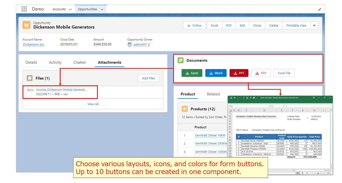
We've released a new version of Office File Creator.
Lightning Component Button
Available to Create Lightning Component Buttons.
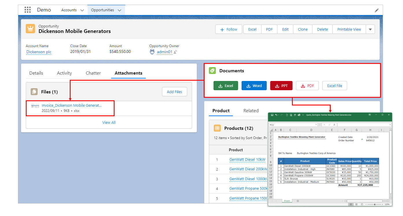
- Various layouts, icons, and colors can be selected for the buttons.
- Up to 10 buttons can be created in one component.
- The output and file saving process is smoother, as there is no screen transition when the button is clicked, as is the case with custom buttons.
Available in Experience Cloud.
Lightning Component form button creation is now available and can be used in Experience Cloud.
When used in Experience Cloud, deploy Lightning Component instead of custom buttons.
Screen Sample
Layout/Title/Icon
Various button layouts can be selected within the component.
Component titles and icons can be set. Icons are selected from the Lightning Design System.
Title with Icon

Title with Icon (one line display)

No Title/Icon

Button grouping (No spacing between buttons when multiple buttons are placed)

Various button icons can be selected.
An icon can be set for the button. The icon is selected from the Lightning Design System.
Example of icon type doctype

(Icon names to be set are from left to right: doctype:excel, doctype:word, doctype:ppt, doctype:pdf)
Example of icon type utility

(Icon names to be set are from left to right: utility:download, utility:upload, utility:file, utility:check)
Various button colors can be selected.
Choose from 7 different colors for the background, text, and border of each button.
Sample of 7 patterns

Buttons can be created in colors that match the type of file output by Office File Creator.

Version
Paid version: Ver. 1.4
Free version: Ver. 1.5
*Existing users of Ver. 1 have been upgraded.
Easy to set up
- Drag & drop the "officeFileCreatorCmp" component from the Lightning record page edit screen to the location where you want to place the button.
- Set the title and icon of the component. *No setting is also available
- Enter the button name in "(Button 1) Label".
- Enter template API name in "(Button 1) Template".
- To save the file as a record attachment, select "file" or "attachment" for "(Button 1) Save".
You can optionally set the button style, etc. To place multiple buttons, set (Button 2) through (Button 10) in the same way. Up to 10 buttons can be placed in one component.
*Template files and template records must be created in advance.
For details on how to set up, please refer to the Instruction manual.
Please refer to the article Icon samples for the document buttons & titles. Use Office File Creator with various layouts and designs to further enhance your Office File Creator experience.
Setup Screen and Form Output Demo